We considered that although users had categorized their complaints using given tags themselves, the category may not be reliable, since users may be confused with the categories them, or they may randomly select categories, mainly aim to submit complaints. Therefore, we think the complaint text may be the most dependable source for what’s the users actual request.
According to that, in unsupervised learning section, we aim to find out how data clustered using different methods, or to say how we should categorize the complaints, base on complaint text and some other categorical and numerical data.
For the data, we labeled categorical data and processed text data with both TFIDF vectorizer and BERT embedding.
/Library/Frameworks/Python.framework/Versions/3.11/lib/python3.11/site-packages/tqdm/auto.py:21: TqdmWarning:

IProgress not found. Please update jupyter and ipywidgets. See https://ipywidgets.readthedocs.io/en/stable/user_install.html
Overview and Prepare Data
In this part, We did following things: 1. Overview dataset - We find that there are users submitted same complaints content several times.
Process data
Drop duplicate rows base on cleaned_complaints, keep only the first one
Label categorical data including Category, Company response, and Company Public Response, count each value to see how labels distributed
Select data and store to new dataset for later use.
Overview data
# Load data setdata = pd.read_csv("../../data/processed-data/complaints.csv")print(data.shape)data.head(3)
(5798, 18)
Complaint_ID
Tags
Date
Timely
Company
Category
Product
Sub-product
Issue
Sub-issue
Complaint
Company Response
Company Public Response
largest_amount
cleaned_complaints
Clean Complaint Length
sentiment_score
negative-score
0
7485989
NaN
2023-08-31
Yes
EQUIFAX, INC.
Credit reporting
Credit reporting or other personal consumer re...
Credit reporting
Incorrect information on your report
Information belongs to someone else
On XX/XX/XXXX I disputed an account via notari...
Closed with non-monetary relief
NaN
0.0
on i disputed an account via notarized affidav...
1524
-0.9753
0.553097
1
7484469
NaN
2023-08-31
Yes
TRANSUNION INTERMEDIATE HOLDINGS, INC.
Credit reporting
Credit reporting or other personal consumer re...
Credit reporting
Incorrect information on your report
Information belongs to someone else
On XX/XX/XXXX I disputed an account via notari...
Closed with non-monetary relief
Company has responded to the consumer and the ...
0.0
on i disputed an account via notarized affidav...
1535
-0.9753
0.548673
2
7484234
NaN
2023-08-31
Yes
Experian Information Solutions Inc.
Credit reporting
Credit reporting or other personal consumer re...
Credit reporting
Incorrect information on your report
Information belongs to someone else
On XX/XX/XXXX I disputed an account via notari...
Closed with explanation
Company has responded to the consumer and the ...
0.0
on i disputed an account via notarized affidav...
1535
-0.9753
0.548673
Process Data
2.1 Drop duplicate rows base on Complaint and cleaned_complaint
data = data.drop_duplicates(subset=['Complaint'])data = data.drop_duplicates(subset=['cleaned_complaints'])print(data.shape)data.head(3)
(4954, 18)
Complaint_ID
Tags
Date
Timely
Company
Category
Product
Sub-product
Issue
Sub-issue
Complaint
Company Response
Company Public Response
largest_amount
cleaned_complaints
Clean Complaint Length
sentiment_score
negative-score
0
7485989
NaN
2023-08-31
Yes
EQUIFAX, INC.
Credit reporting
Credit reporting or other personal consumer re...
Credit reporting
Incorrect information on your report
Information belongs to someone else
On XX/XX/XXXX I disputed an account via notari...
Closed with non-monetary relief
NaN
0.0
on i disputed an account via notarized affidav...
1524
-0.9753
0.553097
1
7484469
NaN
2023-08-31
Yes
TRANSUNION INTERMEDIATE HOLDINGS, INC.
Credit reporting
Credit reporting or other personal consumer re...
Credit reporting
Incorrect information on your report
Information belongs to someone else
On XX/XX/XXXX I disputed an account via notari...
Closed with non-monetary relief
Company has responded to the consumer and the ...
0.0
on i disputed an account via notarized affidav...
1535
-0.9753
0.548673
3
7475961
NaN
2023-08-30
Yes
JPMORGAN CHASE & CO.
Banking
Checking or savings account
Checking account
Problem with a lender or other company chargin...
Transaction was not authorized
On XX/XX/XXXX, an unauthorized wire for {$5400...
Closed with explanation
NaN
5400.0
on an unauthorized wire for was sent on my cha...
648
-0.9100
0.566372
2.2 Label categorical data and view the distribution
Issue                                                                             Issue Label
Incorrect information on your report                                              39             904
Problem with a credit reporting company's investigation into an existing problem  60             705
Improper use of your report                                                       37             421
Managing an account                                                               44             270
Attempts to collect debt not owed                                                 5              264
                                                                                                ...
Improper use of my credit report                                                  36               1
Late fee                                                                          40               1
Lost or stolen check                                                              42               1
Advertising                                                                       1                1
Lost or stolen money order                                                        43               1
Name: count, Length: 87, dtype: int64
Company Response                 Company Response Label
Closed with explanation          0                         3951
Closed with non-monetary relief  2                          717
Closed with monetary relief      1                          275
Untimely response                3                           11
Name: count, dtype: int64
label_encoder = LabelEncoder()data['Company Public Response Label'] = label_encoder.fit_transform(data['Company Public Response'])data[['Company Public Response', 'Company Public Response Label']].value_counts()
Company Public Response                                                                                                  Company Public Response Label
Company has responded to the consumer and the CFPB and chooses not to provide a public response                          8                                2131
Company believes it acted appropriately as authorized by contract or law                                                 3                                 224
Company believes complaint caused principally by actions of third party outside the control or direction of the company  0                                  16
Company believes complaint is the result of an isolated error                                                            1                                  14
Company believes the complaint is the result of a misunderstanding                                                       4                                  11
Company disputes the facts presented in the complaint                                                                    7                                  11
Company believes complaint represents an opportunity for improvement to better serve consumers                           2                                   9
Company believes the complaint provided an opportunity to answer consumer's questions                                    5                                   8
Company can't verify or dispute the facts in the complaint                                                               6                                   2
Name: count, dtype: int64
2.3 Select data and store to new dataset
We can observe from the previous part that for Company Public Response, not only that this column has many missing values, the values are also very unbalance. Most of them have value “Company has responded to the consumer and the CFPB and chooses not to provide a public response”, which are invalid information for us to analyze in this part, therefore we drop this column and select columns cleaned_complaints, Clean Complaint Length, sentiment_score, negative-score, Category Label, and Company Response Label.
Besides, we noticed that in Category column, about half of the data has category label 2, which is also not balance, but the rest data can form a quite balance dataset, thus we droped the rows with category label 2.
We stored the rest of the data to a new data frame.
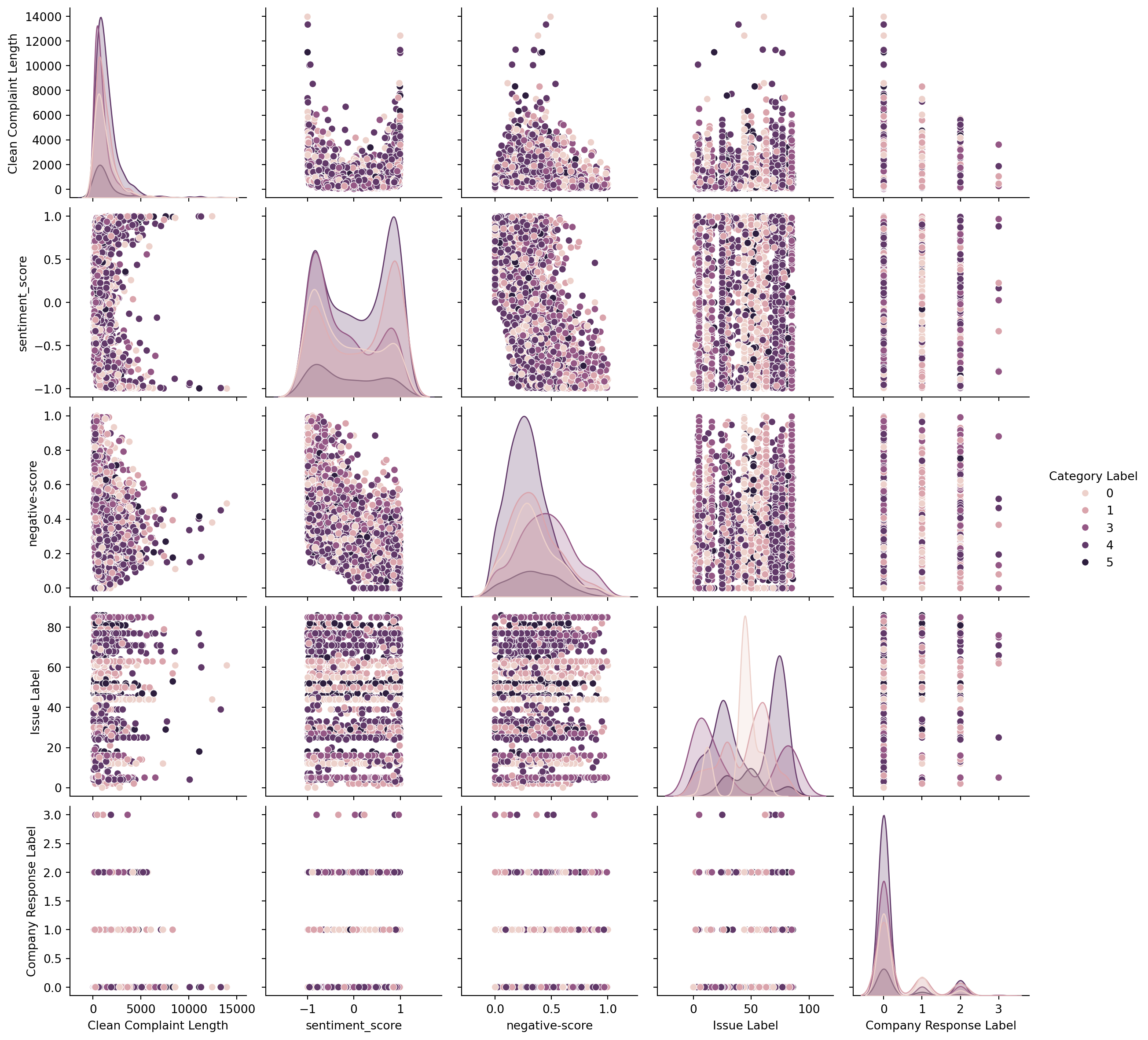
We built a pair plot and found that there dosen’t seem to be any correlation between any two single columns. And according to the colored dots’ distribution, these columns doesn’t seem to be able to feature the categories.
Dimentionality Reduction
PCA (Principal Component Analysis)
PCA is a statistical method used for dimensionality reduction and feature extraction. Its goal is to transform high-dimensional data into a lower-dimensional space while preserving as much variance (information) as possible from the original data.
The core idea of PCA is to find the principal components where the data varies the most, and then represent the data based on these directions. It achieves this by computing the covariance matrix of the data to identify the directions with maximum variance.
In this section, we applied PCA method to three different kind of data: TFIDF vectorized complaint text, BERT embedded complaint text, and other categorical data and numerical data. We would like to see which data performs better.
We will do PCA in this part in following steps: - plot variance explained retio and cumulative explained variance, inorder to find out the optimal number of principal components. - use the optimal n_components we just find out to plot a 2D PCA plot.
Define functions to plot variance explained ratio and cumulative explained variance
We used two measurments here:
Variance explained ratio
How much ratio of information each components can explain or represent, that is the larger the ratio is, the more information this component can explain and the more important this component is.
Cumulative explained variance
How much information the first n components can explain or represent in total. This value will gradually increase to 1 as the number of components increase. Usually, 0.8 to 0.9 of the cumulative explained variance would be enough.
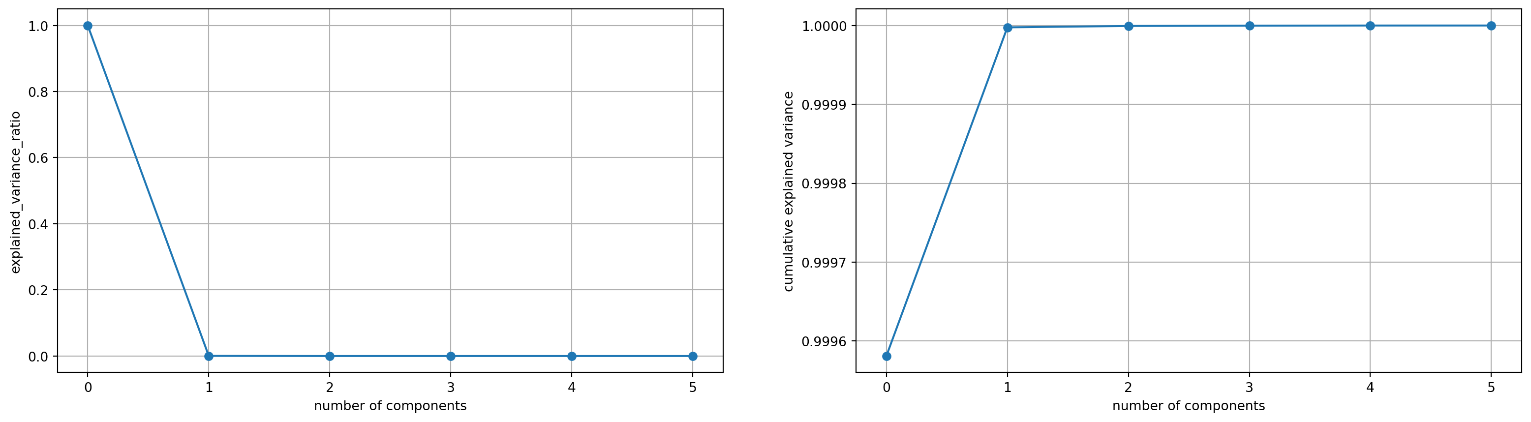
def plot_variance_explained(pca):print("Variance explained by each principal component:")print(pca.explained_variance_ratio_[:10])print("Cumulative variance explained by each principal component:")print(np.cumsum(pca.explained_variance_ratio_)[:10]) plt.subplots(nrows =1, ncols =2, figsize = (20, 5)) plt.subplot(1, 2, 1) plt.plot(pca.explained_variance_ratio_, marker ='o') plt.xlabel("number of components") plt.ylabel("explained_variance_ratio") plt.grid() plt.subplot(1, 2, 2) plt.plot(np.cumsum(pca.explained_variance_ratio_), marker ='o') plt.xlabel("number of components") plt.ylabel("cumulative explained variance") plt.grid()
Define functions to plot 2D PCA
We choose to use the top 2 principle components to plot the 2D PCA plot
We build a new dataset with cleaned_complaints in tdidf vectorization format and remove the origin cleaned_complaints column.
df_tfidf = data.copy()vectorizer = TfidfVectorizer(max_df =0.5)X = vectorizer.fit_transform(data['cleaned_complaints']).toarray()df_tfidf['complaint_tfidf'] = [tfidf_vec for tfidf_vec in X]df_tfidf.drop(columns = ['cleaned_complaints'], inplace =True)df_tfidf.head(3)
Clean Complaint Length
sentiment_score
negative-score
Category Label
Issue Label
Company Response Label
complaint_tfidf
0
648
-0.9100
0.566372
0
61
0
[0.0, 0.0, 0.0, 0.0, 0.0, 0.0, 0.0, 0.0, 0.0, ...
1
1074
-0.8255
0.389381
3
16
0
[0.0, 0.0, 0.0, 0.0, 0.0, 0.0, 0.0, 0.0, 0.0, ...
2
743
-0.4909
0.469027
5
18
0
[0.0, 0.0, 0.0, 0.0, 0.0, 0.0, 0.0, 0.0, 0.0, ...
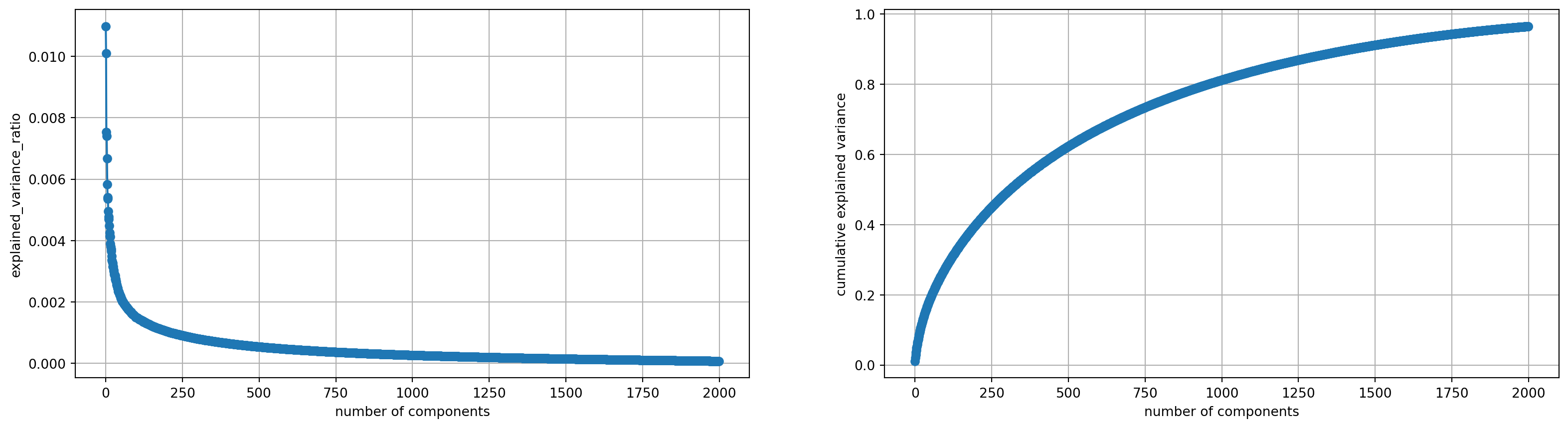
After we had the tfidf-vectorized text and data prepared, we applied it to PCA.
We tried with n_components = 10 at first, but we noticed that although there is elbow point, in explained variance ratio, the cumulative explained variance is less than 0.1 which is too small, Therefore we thried with large n_components such as the plot shown below where n_componets = 2000.
This time we noticed that although the cumulative explained variance reached about 80% when n_components is around 1000, components before the elbow point of n_components = 9 actually did much devote to the explained variance, thus we chose n_component = 9 to be our optimal parameter.
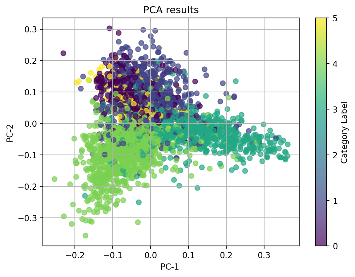
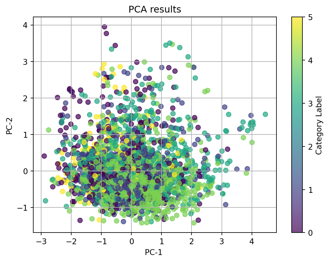
We then used the optimal n_components = 9 to plot 2D PCA plot.
We observe that category 1, 3, 4 quite cluster according to the dots’ colors when using tfidf-vectorized complaint text to do dimentionality reduction. However, thereare quite serious overlaps between clusters, especially for category 0 and 5. If we ignore the labeled categories, which are represented with the colors, all the dots are clustered together and we can not identify any clear cluster.
1.2 PCA with BERT-embedded cleaned_complaints
We build a new dataset with cleaned_complaints in BERT embedding format and remove the origin cleaned_complaints column.
We applied the BERT embedded complaint text to PCA.
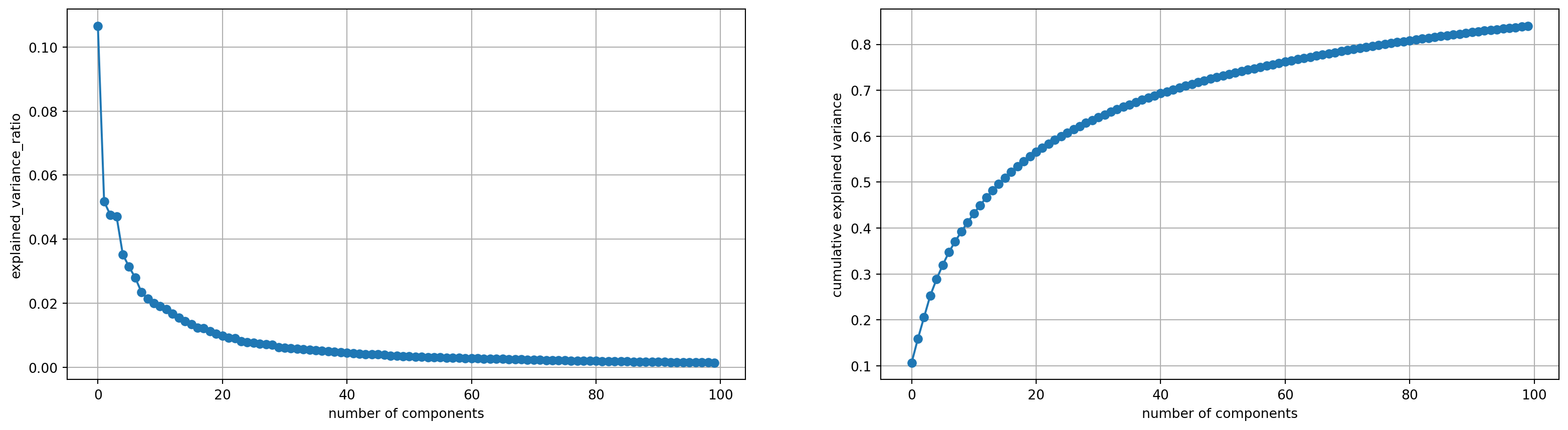
This time, we firstly took a look at all about 800 components and we found that the cumulative explained variance reached 80% when n_components = 75, therefore we plot the to plots about the explained variance with n_components=100.
Then, we noticed that the elbow point in explained variance ratio plot is at about n_components = 9, and when the number is larger than 9, the variance each components could explain doesn’t make much differences. We took a look of the cumulative explained variace plot at n_components = 9. Cumulatively, the top 9 componets can explained more than 40% of the variance, which devote a lot to the total. Thus, we chose n_component = 9 to be our optimal parameter in this case.
We then used the optimal n_components = 9 to plot 2D PCA plot.
Dots with different colors all mix together and if ignore the color, there are no clusters. We can say that BERT embedding doesn’t perform well with PCA.
1.3 PCA with other categorical and numeric data
We selected all other data except for the text data to build a new data frame
Since there are 6 columns, we simply used n_components = 6 to find out which is the optimal n_components.
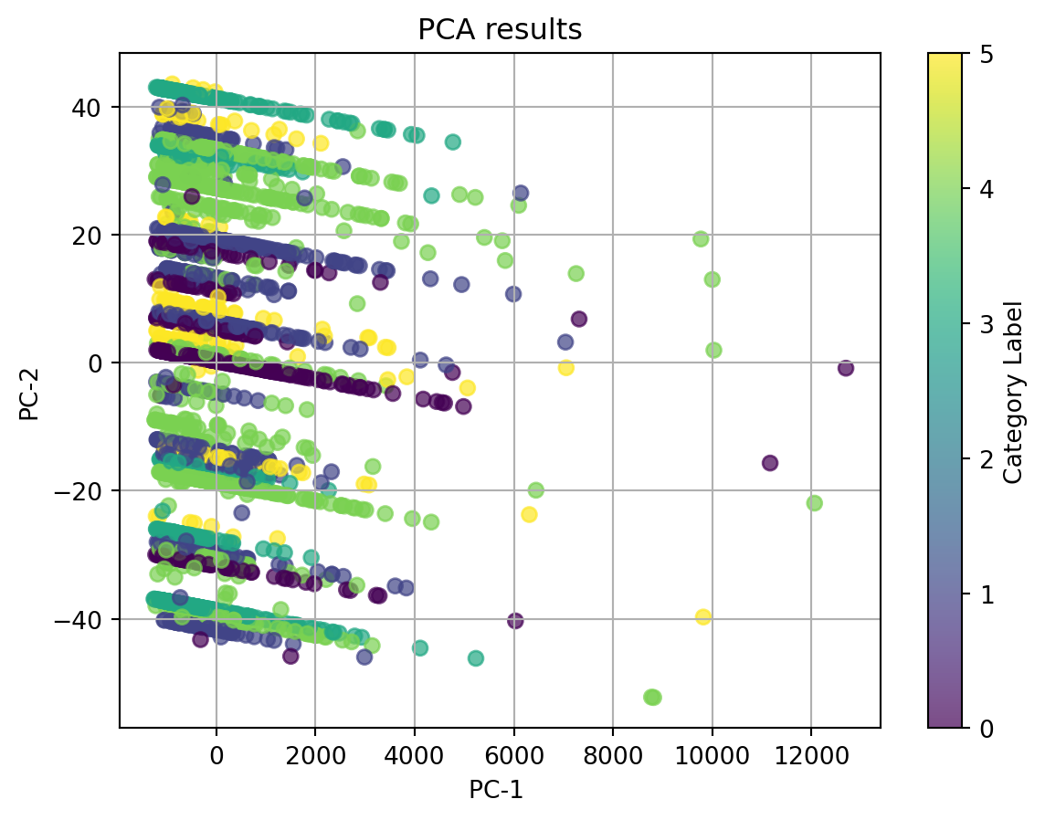
We noticed that there is a powerful component that can explain more than 99% of the information by itself. Therefore, we used n_components = 2 as our optimal n_components in this case.
Then we applied this n_components to plot the 2D PCA plot.
Variance explained by each principal component:
[9.99580862e-01 4.16817592e-04 1.73955249e-06 3.36292734e-07
 2.26460588e-07 1.85278793e-08]
Cumulative variance explained by each principal component:
[0.99958086 0.99999768 0.99999942 0.99999976 0.99999998 1.        ]
This time, we noticed that the top 2 components are the clean complaint text length and the issue, especially the clean complaint text length, which is the powerful component. We can see that dots with same color clustered but have more than one cluster for each color. It’s hard to cluster our data with our applied data.
t-SNE is a nonlinear dimensionality reduction technique primarily used for visualizing high-dimensional data. It maps high-dimensional data into a lower-dimensional space (usually 2D or 3D) while preserving the local structure and pairwise similarities between data points.
The main goal of t-SNE is to compute the similarities between data points in the high-dimensional space using probability distributions; to map the data points into a low-dimensional space such that their pairwise similarities are preserved; to use a t-distribution instead of a Gaussian distribution for low-dimensional space, reducing the crowding problem and allowing for better separation of clusters.
In this section, we applied PCA method to two different kind of data: TFIDF vectorized complaint text, BERT embedded complaint text.
We will preform different perplexities on each of the two data and see which perplexity and which data bave better performance.
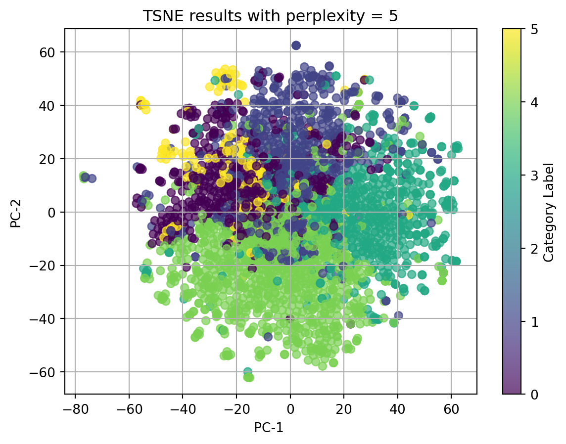
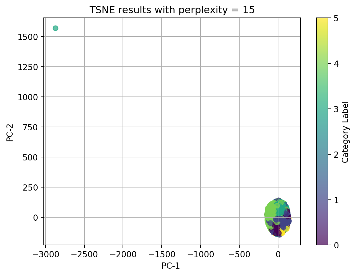
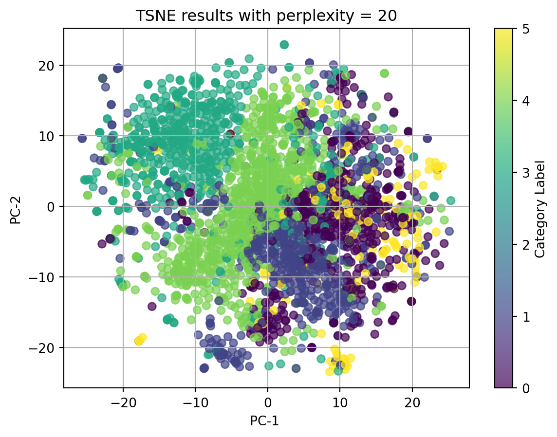
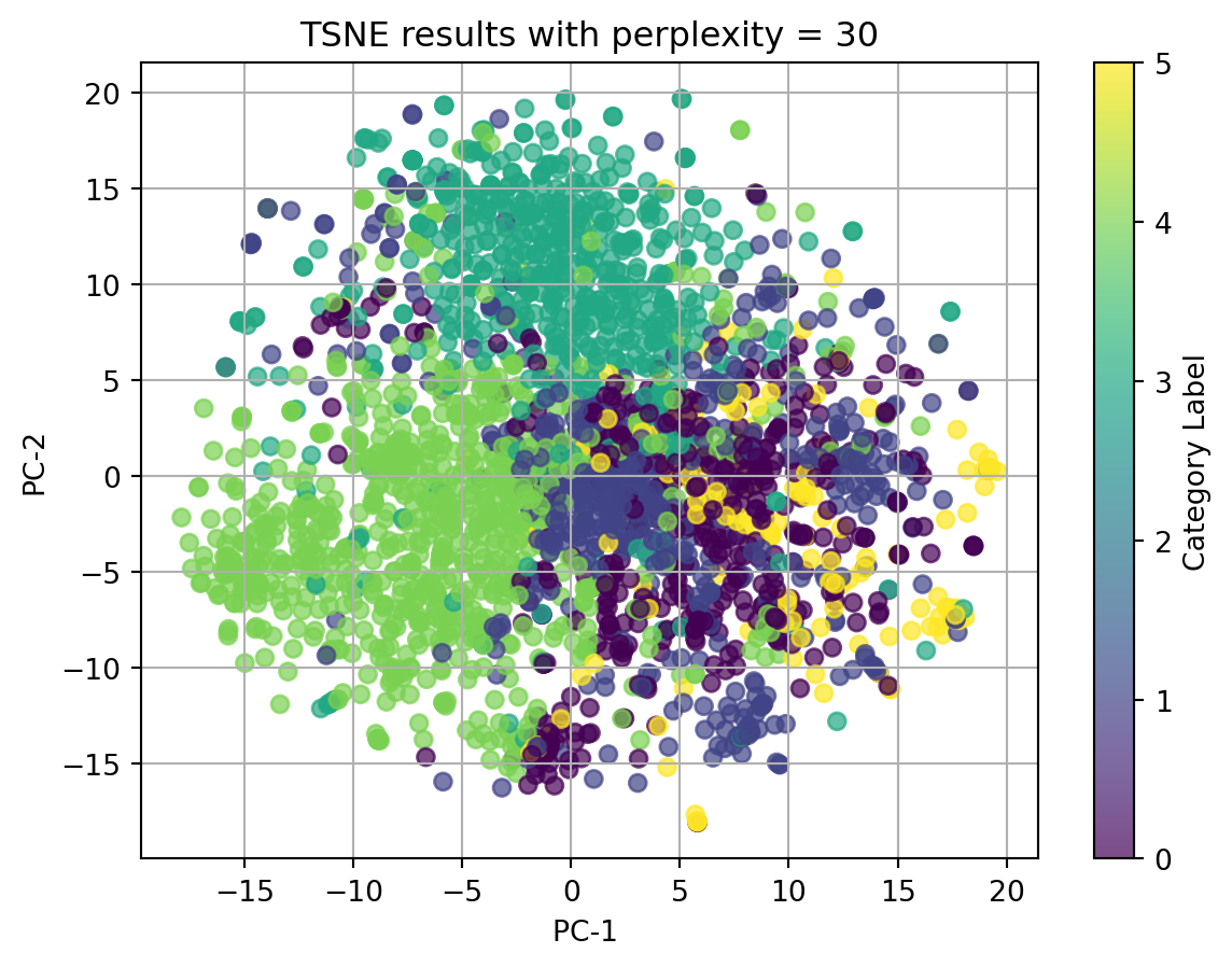
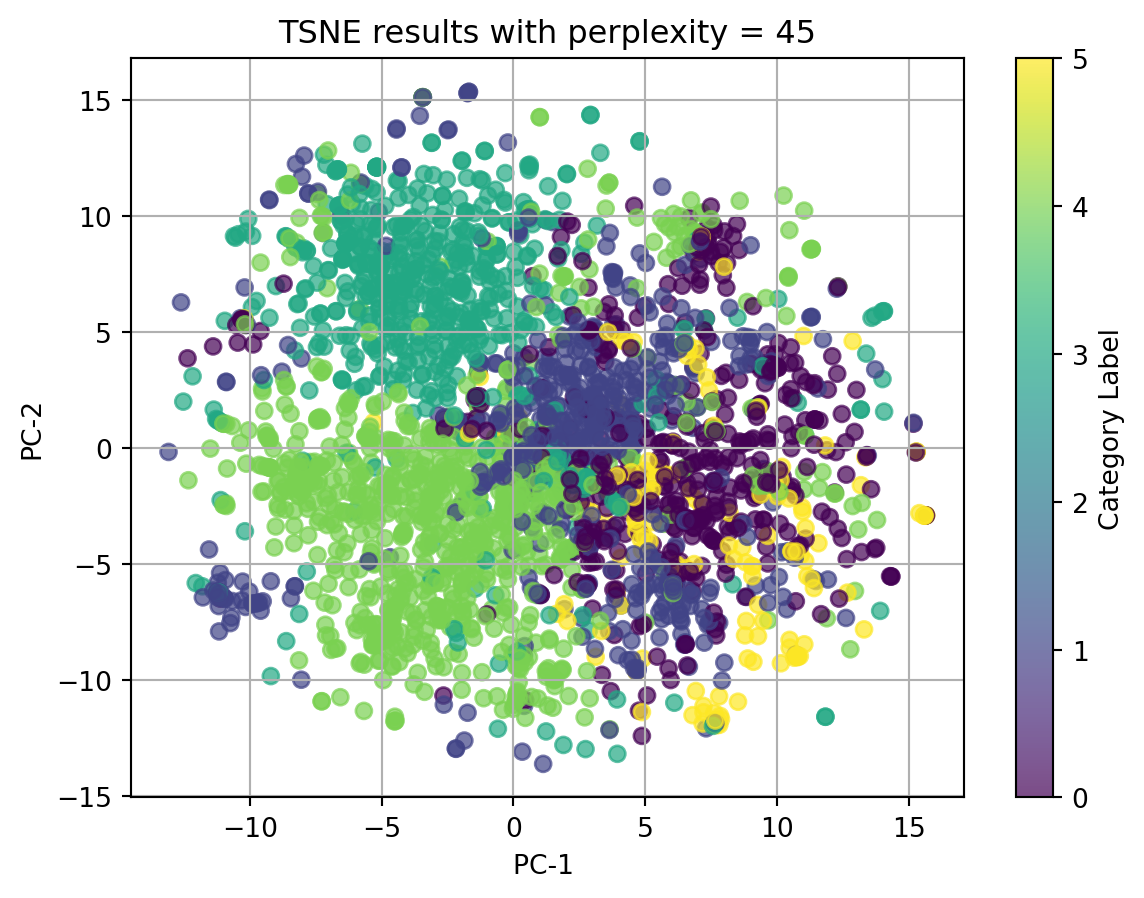
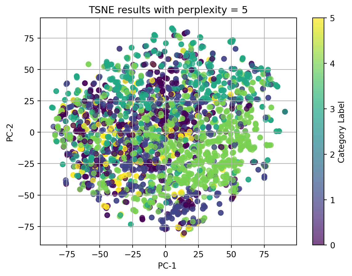
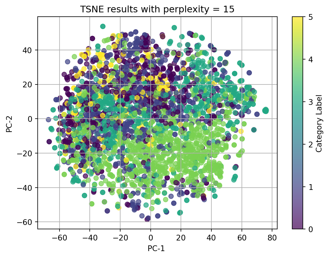
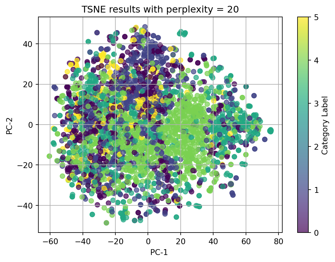
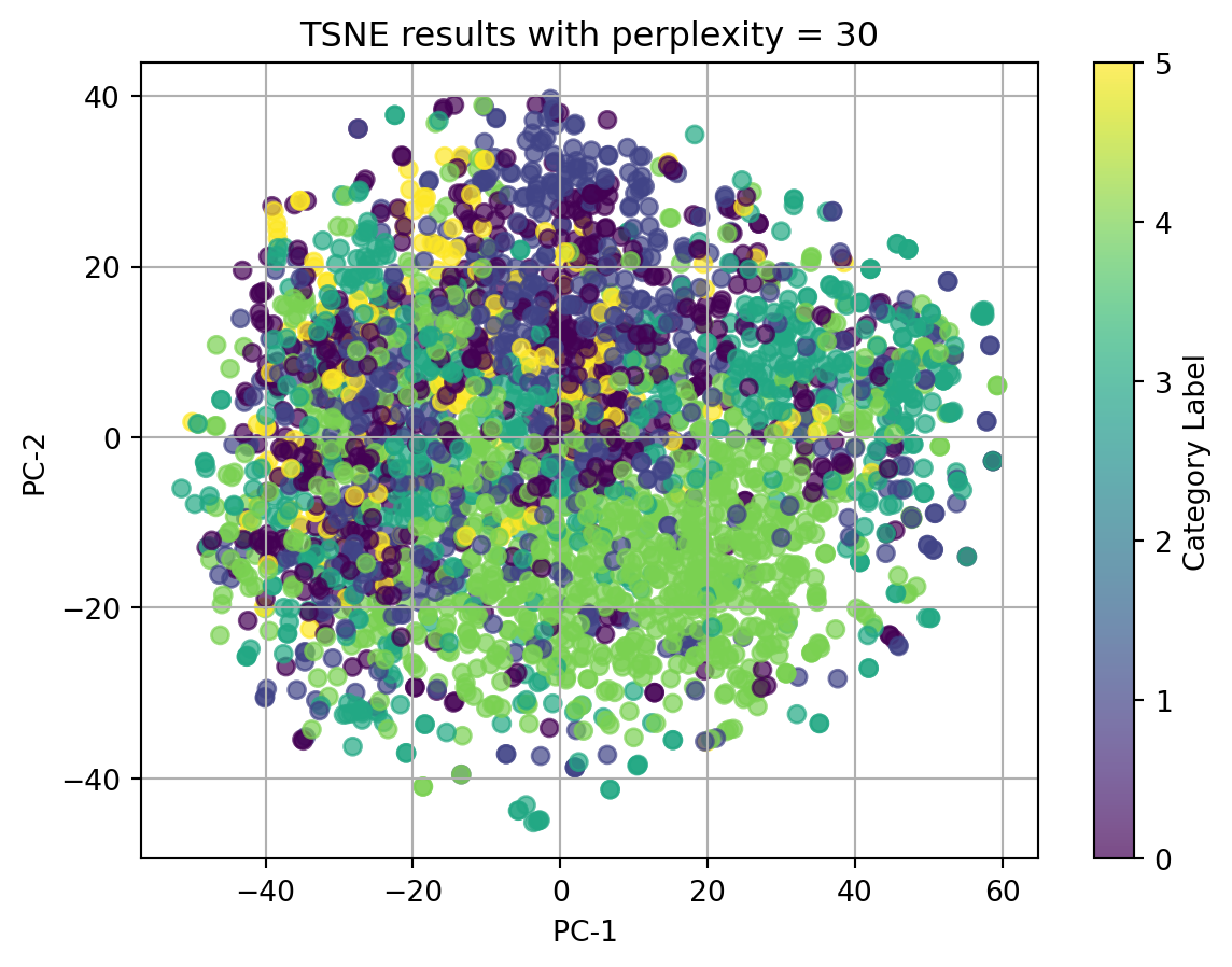
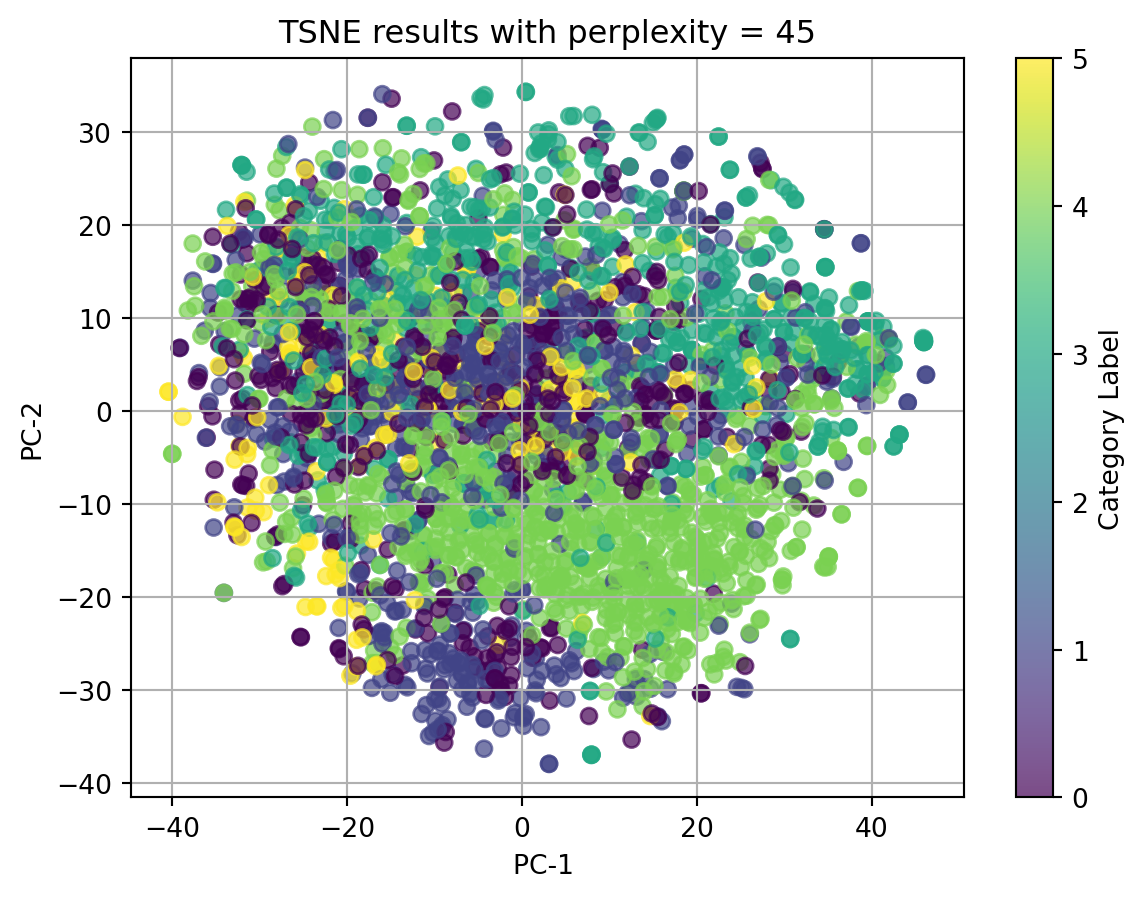
2.1 t-SNE with TFIDF-vectorized cleaned_complaint, using different perplexities
perplexities=[5, 15, 20, 30, 45]for perplexity in perplexities:print(f"TSNE for perplexity = {perplexity}") plot_2D_TSNE(X_tfidf, 'Category Label', perplexity)
TSNE for perplexity = 5
huggingface/tokenizers: The current process just got forked, after parallelism has already been used. Disabling parallelism to avoid deadlocks...
To disable this warning, you can either:
    - Avoid using `tokenizers` before the fork if possible
    - Explicitly set the environment variable TOKENIZERS_PARALLELISM=(true | false)
TSNE for perplexity = 15
TSNE for perplexity = 20
TSNE for perplexity = 30
TSNE for perplexity = 45
2.2 t-SNE with BERT-embedded cleaned_complaint, using different perplexities
perplexities=[5, 15, 20, 30, 45]for perplexity in perplexities:print(f"TSNE for perplexity = {perplexity}") plot_2D_TSNE(X_bert, 'Category Label', perplexity)
TSNE for perplexity = 5
TSNE for perplexity = 15
TSNE for perplexity = 20
TSNE for perplexity = 30
TSNE for perplexity = 45
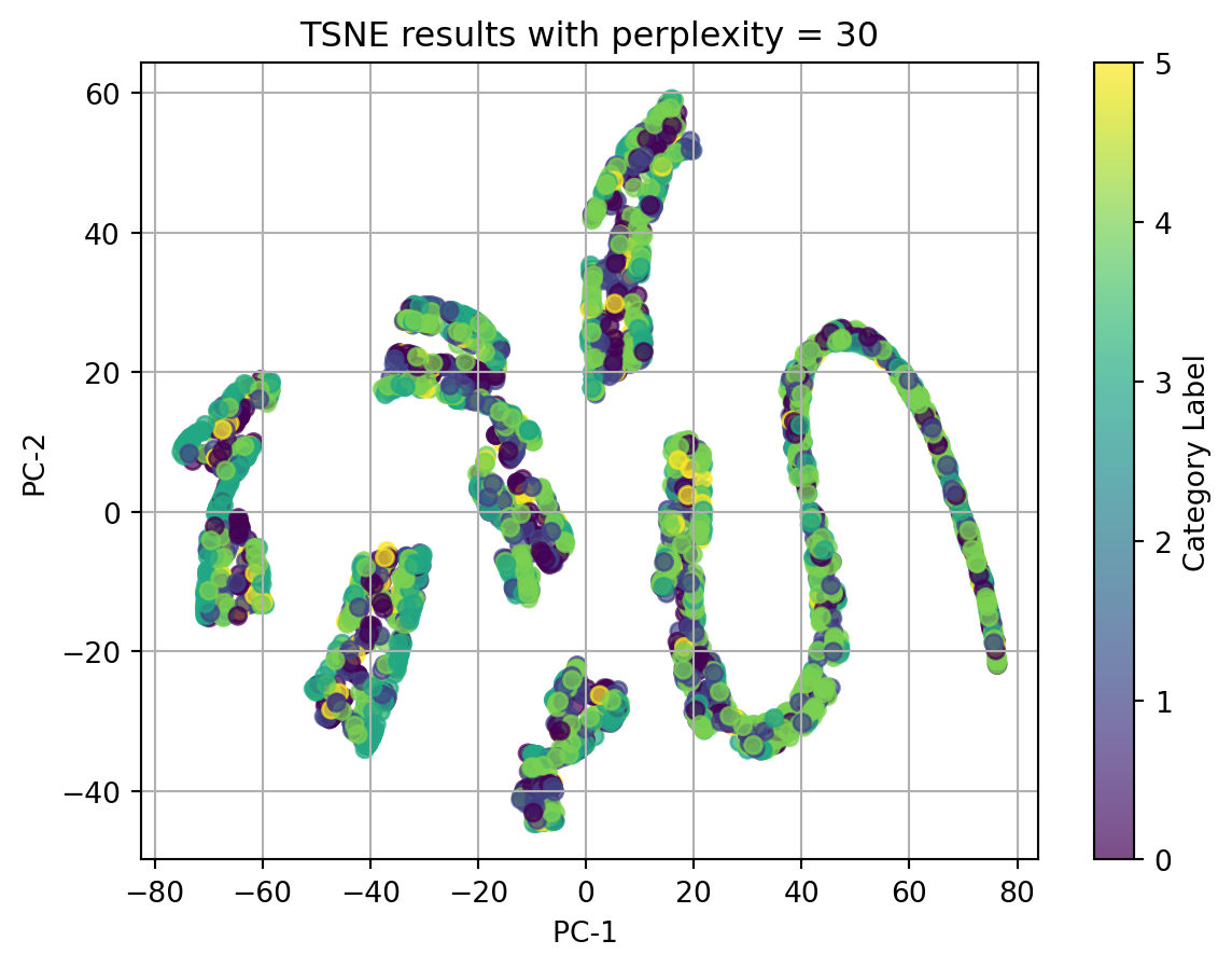
2.3 t-SNE with other categorical and numeric data
print(f"TSNE for perplexity = 30")plot_2D_TSNE(X, 'Category Label', 30)
TSNE for perplexity = 30
In conclusion, t-SNE on tfidf-vectorized text data and with perplexity = 5 can match the best with our origin category. Although there isn’t clear splitted clusters, we can see dots with same colors cluster together.
Ignore our origin categories, which represented by the colors, in the plots using texts, all dots gather together and there is no clear clusters. In the plot using other categorical data and numerical data, we can see well seperated clusters.
Therefore, we can conclude that when using t-SNE, text data in any format doesn’t have good performance, and t-SNE do have good performance on nonlinear data.
Evaluation and Comparison
3.1 Effectiveness in preserving data structure
PCA should have advantages in solving linear data. It works well in capturing global structure in the data by preserving linear relationships between variables. However, since the data we use doesn’t have linear relationships between any two variables according to the pairplot, and the texts we use are in high-dimensional structure, PCA doesn’t have much performance in showing the effectiveness in preserving data structure.
t-SNE in this case did better in preserving data structure. It is designed to have better performance in solving high-dimensional data and non-linear data. We get better result using t-SNE.
3.2 Compare the visualization capabilities
We use PCA to do visualization by map the data to the axes representing the component that explains the most variances and generate lower-dimensional plot. In this way, we can visualize global structure of data base on the top components. However, according to this, I think PCA don’t have much capability in visualizing non-linear data. When dealing with data that have linear relationships, no matter which component the data is mapped to, all component are related, which is also how PCA works for preserving data structure for data with linear relationship, but it’s not the same with nonlinear data.
t-SNE performs better in this case. The plot generated with t-SNE has better cluster feature.
3.3 Trade-offs and scenarios
Efficiency: When running the code for PCA and t-SNE with the same data, I noticed that t-SNE took much more time than PCA, therefore I think t-SNE is more time-consuming and PCA is more efficient.
Linear/nonlinear data: As we mentioned a lot in the previous two parts, PCA will perform well with linear data and t-SNE has better performance in nonlinear and high-dimensional data. This is one consideration when we are thinking about which dimentionality reduction method to use.
Visualization capabilities: In my opinion, t-SNE has better performance in visualization
Clustering
We now come to clustering section. In this section, we aim to find out in order to categorize the complaints, what should the operators depend on. Also, since we observed that based on the origin category, what the users actual want to complaint according to their complaint text are not categorized well, we want to validate if it is origin category’s problem, or to say if there are ways to categorize the complaints well.
Here, we used 3 clustering methods: K-Means, DBSCAN, and Hierarchical clustering.
We will apply each clustering methods in this part in following steps: - Find out the optimal parameters - apply optimal parameters we just find out to the models with certain data. - plot the result with PCA
K-Means
K-Means is an unsupervised learning method that cluster data into K clusters, by minimize the sum of squared distances between the data points and the centroids of their respective clusters.
The model will randomly initialize k centroids. The other data points will be assigned to its nearest centroid base on the Eucilidean distance and clusters are formed. Then, we find the centroid of each clusters and assign data points again. The model will repeatedly do these steps untill the centroids are not changing anymore.
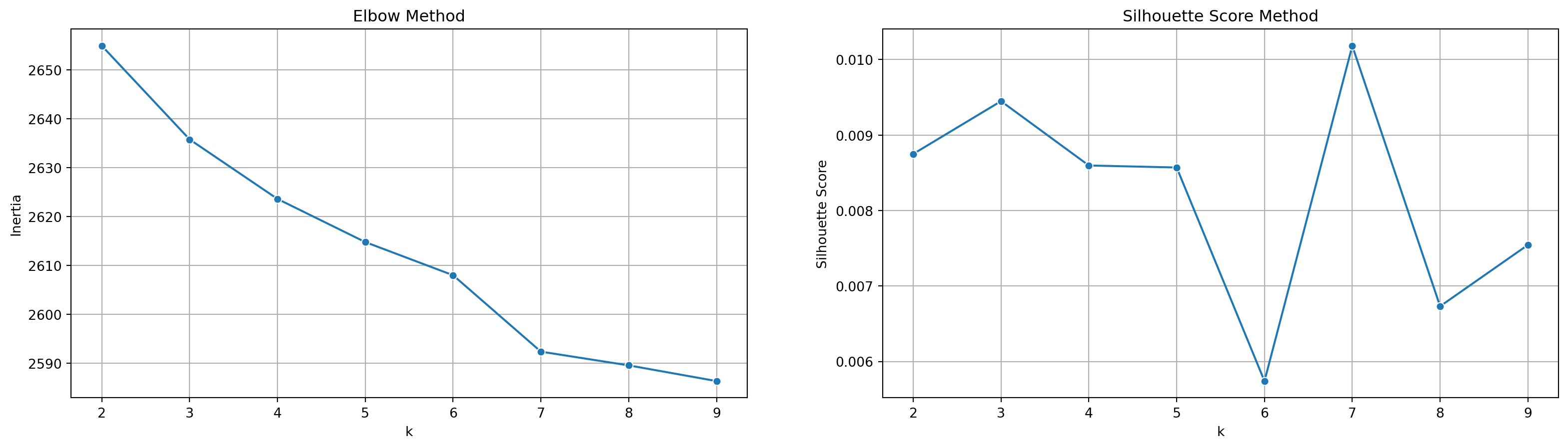
Model Selection:
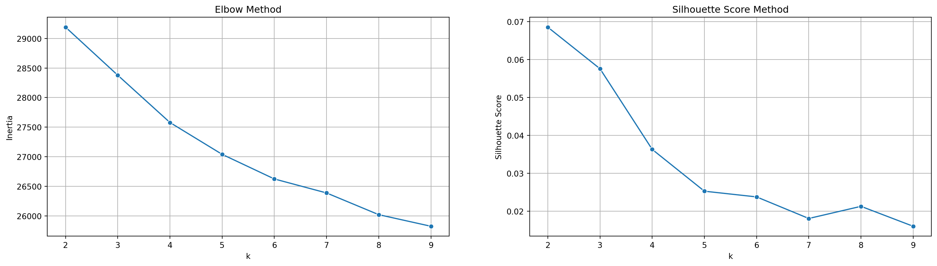
Inertia: or sum of squared errors, measures the compactness of clusters by summing the squared distances between points and their assigned centroids. As K increases, inertia decreases. We apply this in Elbow method, where we aim to find a elbow point at which the inertia reduction slows down.
Silhouette Score: it evaluates clustering performance by considering both distance within and between clusters. The optimal n_clusters value we aim to find should have the highest average silhouette score.
Define model selection function by ploting inertia and silhoustte scores for kmeans, to find out the optimal n_clusters
def model_selection_kmeans(x): inertia_value = [] sil_scores_kmeans = [] params_kmeans = []# Hyper-parameter tuningfor k inrange(2, 10): model = KMeans(n_clusters = k).fit(x) inertia_value.append(model.inertia_)# Calculate the silhouette score for each k labels = model.labels_ sil_score = silhouette_score(x, labels)try: sil_scores_kmeans.append(sil_score) params_kmeans.append(k)except:continue# Visualization plt.subplots(nrows =1, ncols =2, figsize = (20, 5))# Plot for inertia vs. k to find "elbow point" plt.subplot(1, 2, 1) sns.lineplot(x =range(2, 10), y = inertia_value, marker ='o') plt.title('Elbow Method') plt.xlabel("k") plt.ylabel("Inertia") plt.grid()# Plot for silhouette score vs. k plt.subplot(1, 2, 2) sns.lineplot(x =range(2, 10), y = sil_scores_kmeans, marker ='o') plt.title('Silhouette Score Method') plt.xlabel("k") plt.ylabel("Silhouette Score") plt.grid()
Define a function to apply the optimal n_clusters value to kmeans model with certain data.
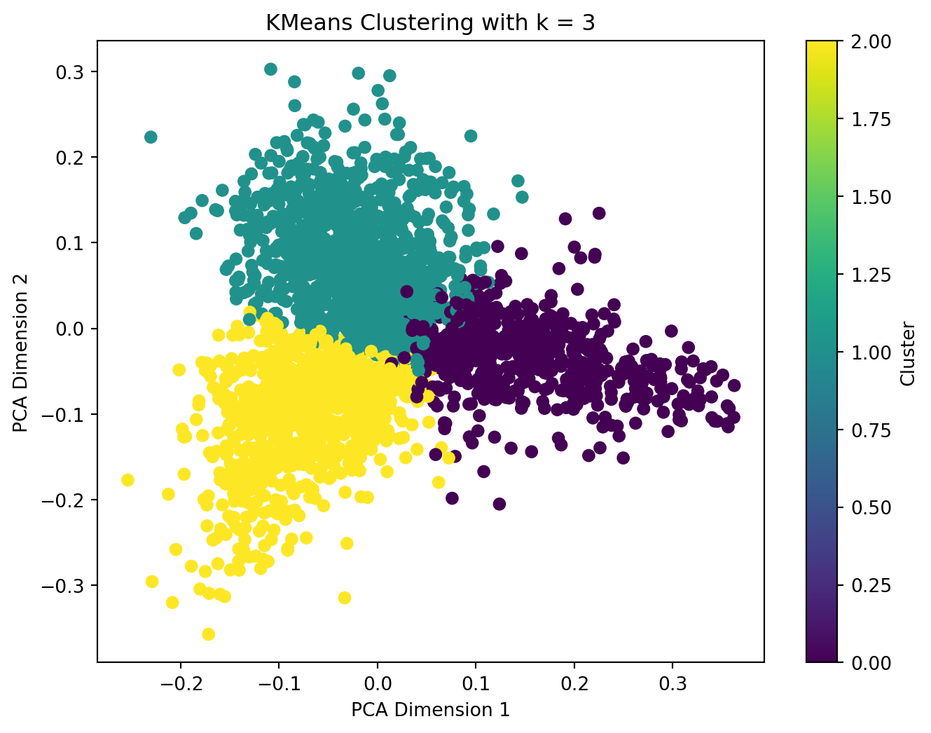
1.1 kmeans with TFIDF-vectorized cleaned_complaints
model_selection_kmeans(X_tfidf)
apply_kmeans(3, X_tfidf)
When applying TFIDF-vectorized complaints to kmeans model, in this case, we observed that the optimal n_clusters value is 3 since the inertia decreases progressively, thus, there is no obvious elbow point in the plot using elbow method, and in silhouette score plot, the score reach the largest at n_cluster = 3.
We then apply the optimal n_cluster = 3 to kmeans model and plot the result with PCA. We can see clear clusters in 3 colors, although they have connections on the edge, there are not much overlaps.
1.2 kmeans with BERT-embedded cleaned_complaints
model_selection_kmeans(X_bert)
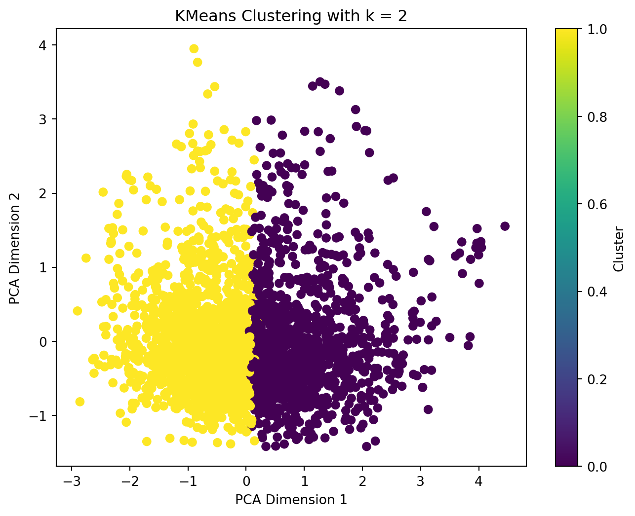
apply_kmeans(2, X_bert)
Although BERT-embedded text doesn’t provide good performance in previous parts, we still want to give it a chance with kmeans.
When applying BERT-embedded complaints to kmeans model, we observed that the optimal n_clusters value is 2 since the inertia decreases progressively, and in silhouette score plot, the score reach the largest at n_cluster = 2.
We then apply the optimal n_cluster = 2 to kmeans model and plot the result with PCA. The entire dataset is divided into 2 halves with only a little overlap on the edge.
However, with the similar performance, we can get 3 clusters using TFIDF-vectorized text while only 2 clusters using BERT-embedded text. Therefore, we will not apply BERT-embedded text in later parts.
DBSCAN (Density-based spatial clustering of applications with noise )
DBSCAN identifies clusters as areas of high data point density separated by regions of low density. By applying this cluster method, data points will be splitted into three classificarions: core points, border points, and noise points.
The algorithm starts with an unvisited point, then checks its neighborhood, and expands clusters by recursively visiting neighboring points.
Model Selection:
Silhouette Score: in this case, sil_score can help evaluate clustering quality. The idea is still trying to meet the maximum silhouette by adjusting the hyper parameters.
Define a model selection function by calculating the parameter that can form the largest silhouette score.
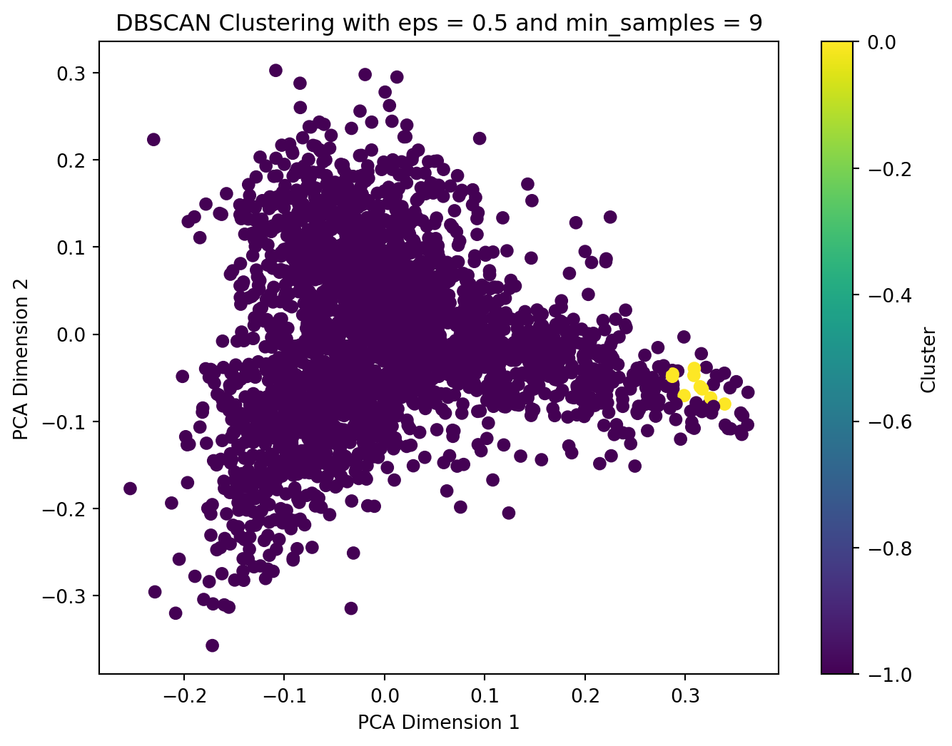
We applied TFIDF-vectorized complaint text to DBSCAN model. We get the optimal parameters of eps = 0.5 and optimal min_samples = 9 when we have the largest silhouette score. After we have applied the optimal parameters with the text data to DBSCAN model and plot the result with PCA, we find out that most DBSCAN labels are noise. It’s definitely not what we want.
However, it’s quite reasonable for DBSCAN, since it need to calculate the distances and for high-dimentional data like what we applied to the model, text vectors, it’s hard to calculate the distances, and lead to what we get. It may seem weird that almost all data points are shown as noise in the 2D PCA plot, but globally view the data points, there are far more than 2 dimentions in the space.
Hierarchical Clustering
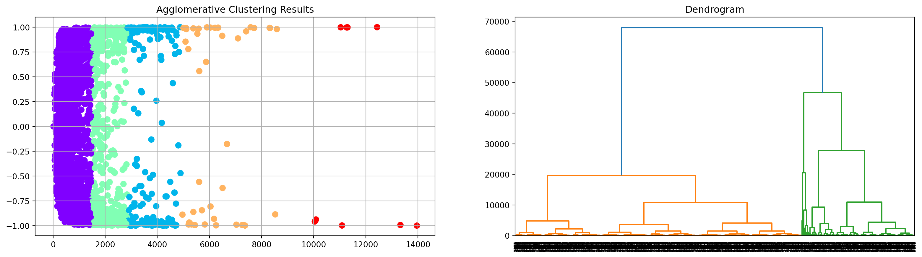
Hierarchical clustering builds a hierarchy of clusters using a tree-like structure called a dendrogram. It operates in two modes. In our project, we applied agglpmeratice mode, that is each data point starts clustered, then data points’ branches merge base on linkage method in this case until all points form a singlr cluster. It’s a bottom-up process.
There is also a top-down method which we didn’t use in our project, that is start with a large cluster then split step by step.
Lastly, we applied the categorical and numerical data to hierarchical clustering. The clustering result presented in the scatter plot actually perform well, only the result is not quite balanced in the 5 cluster.
We also drew a denfrogram with the same data. The plot shows that the data is clustered into 2 parts.
Conclusion
According to all dimentionality reduction parts and clustering parts, we can conclude that for our text data, TFIDF vectorization works a bit better than BERT embedding, t-SNE works better than PCA in visualization, KMeans method works well but definitely not DBSCAN. For other categorical data and numerical data, t-SNE works well in dimentionality reduction and hierarchical clusters well.
In conclusion to our topic, as we assumed at the beginning, the product category doesn’t seem to have close relationship with users’ actual complaint content, or one of another assumption is that the product categories are too similar to each other and don’t have much difference, which may also misleading the users when submitting their complaint. The product category can’t categorize the complaints properly.
Base on our model results, we can see that there are different ways we can apply to form better categorization in order to enhance the efficiency of complaint handling. We now have the clusters, for further research, maybe we can dive into each clusters to specify each cluster’s topic.